There was a Hacker News Thread discussing the Iosevka font this past week. Being a self-described font nerd I had to give it a try! It wasn’t anything like FOMO dictating this decision, but rather an ongoing curiosity to see if any newcomer could unseat the long-reigning king: DejaVu Sans Mono.
For over a decade I’ve been using DejaVu (and its predecessor Bitstream Vera) for all of my programming font needs. Its legibility for programming is incredible, and its copyleft license meant I could include it in my dotfiles repo without any concern. It’s weasled its way into my i3wm, vim, Codium, and IntelliJ configs as a result. It’s gotten to the point where things simply don’t look right if I haven’t configured the font properly on any machine I use.
Does all of this make me anal retentive? Probably. You might picture me wrinkling my nose upon logging into some remote terminal and finding it using a plain-jane, system monospace font: blasphemy! It’s not too far from the truth. So when Iosevka showed up on the front page of HN, I immediately began sizing it up. Could this be…the one?!? It might be! It certainly checks some of my boxes:
- Is it monospace? Yup - it’s geared towards programming. Of course it’s going to be monospace.
- Does it have a copyleft license? Yes! It uses the SIL Open Font License.
- Is it available in the formats I might need? Definitely. I most often just use the TTF, but WOFF2 is there if I need it.
- Do any of the glyphs look wonky to the point of distraction (subjectively speaking)? Slightly, but we’ll soon see how to address that.
It obviously has a bunch of things already in its favor, but the one thing - the killer feature, if you want to call it just one feature - that sets this font apart is its customizability. Iosevka has a beautiful web app and corresponding build system that lets you tweak the font to your satisfaction. Being a tinkerer at heart, this really resonated with me and I set about tuning it to match my exact preferences. Let’s dive into that now.
The default width of 1/2 em was a bit too horizontally compressed for my liking, so I opted for the Extended
variant to give the characters more breeze (as the author puts it). That’s simple enough to do by selecting
Extended as Normal in the Width Option dropdown.
As alluded to earlier, I’m mostly coding in terminals or IDEs and reading text in the title or status bars of my window manager. You don’t need too many font weights for that use case, so having nine weights is really overkill. I slimmed down the available weights by 50% by just selecting light, regular, medium, and bold.
The italic variant of the font changes some glyphs, whereas the oblique variant just kinda tilts them to the side a bit. I prefer the latter behavior, and so turned off generation of the italic variant. The end result is the first section of the customizer looking like so:

The next section of the customizer exposes a metric ton of flexibility. Here’s where you can set
your “base” font style, from which all other changes will be based. There’s quite a few
of these to choose from, so if your current favorite font is on the list then it’s best to start there.
That way you can start from more sensible defaults, addressing just the things that bother you.
The default base looks fine to me, so I left the Inherits dropdown at Default and turned my attention to the individual
characters I wanted to change.
There’s only a few characters that jumped out to me as needing to change. The i and j characters weren’t serif-ed like the other lower case characters, so I selected the “tailed-serif” variants for those. The curly braces ({ and }) looked a bit too curly for my taste, so I set that one to their “straight” variants which resemble more of the DejaVu style. Lastly I changed the percent sign (%) to its “rings-continuous-slash” variant which better delineates the slash from its two dots. The end result looks like this in the customizer UI, which helpfully highlights the things you’ve changed in blue:

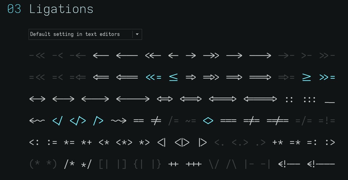
The next section of the customizer is for ligations, or ligatures. This is when two characters are combined into one glyph when they’re next to each other. In the context of programming, this is done to increase legibility: sometimes things like != or -> look better as one unified character instead of two disjoint ones.
Having not used ligatures in fonts for the past decade, I don’t really have a strong preference for them either way, but since I’m in the mood to try new things I’ll leave them on and see how it goes. What’s the worst that could happen, right? Enabling ligations is the default setting for the customizer’s third section which ends up looking like so:

The fourth section of the customizer spits out the textual configuration you need to pass into the build system to render/compile the font with all of the customizations you’ve selected. After all the changes I’ve made thus far the text box contained the following for me:
[buildPlans.iosevka-antibody]
family = "Iosevka Antibody"
spacing = "normal"
serifs = "sans"
no-cv-ss = true
export-glyph-names = false

[buildPlans.iosevka-antibody.variants.design]
i = "tailed-serifed"
l = "tailed-serifed"
brace = "straight"
percent = "rings-continuous-slash"

[buildPlans.iosevka-antibody.weights.light]
shape = 300
menu = 300
css = 300

[buildPlans.iosevka-antibody.weights.regular]
shape = 400
menu = 400
css = 400

[buildPlans.iosevka-antibody.weights.medium]
shape = 500
menu = 500
css = 500

[buildPlans.iosevka-antibody.weights.bold]
shape = 700
menu = 700
css = 700

[buildPlans.iosevka-antibody.widths.normal]
shape = 600
menu = 5
css = "normal"

[buildPlans.iosevka-antibody.slopes.upright]
angle = 0
shape = "upright"
menu = "upright"
css = "normal"

[buildPlans.iosevka-antibody.slopes.oblique]
angle = 9.4
shape = "oblique"
menu = "oblique"
css = "oblique"
There’s a helpful Docker image encapsulating the NodeJS-based build
system for the font, so I used that. I placed the above text given to me by the customizer into a private-build-plans.toml
file nested within its own directory and simply ran: docker run -it -v $(pwd):/build avivace/iosevka-build
to generate the font locally. The fonts are created in a dist directory from which you can
install them on your system. I’m on Linux, so this meant copying them into ~/.fonts/ and then
running fc-cache -f to flush the cache, allowing me to select the font in my tools. Hooray!
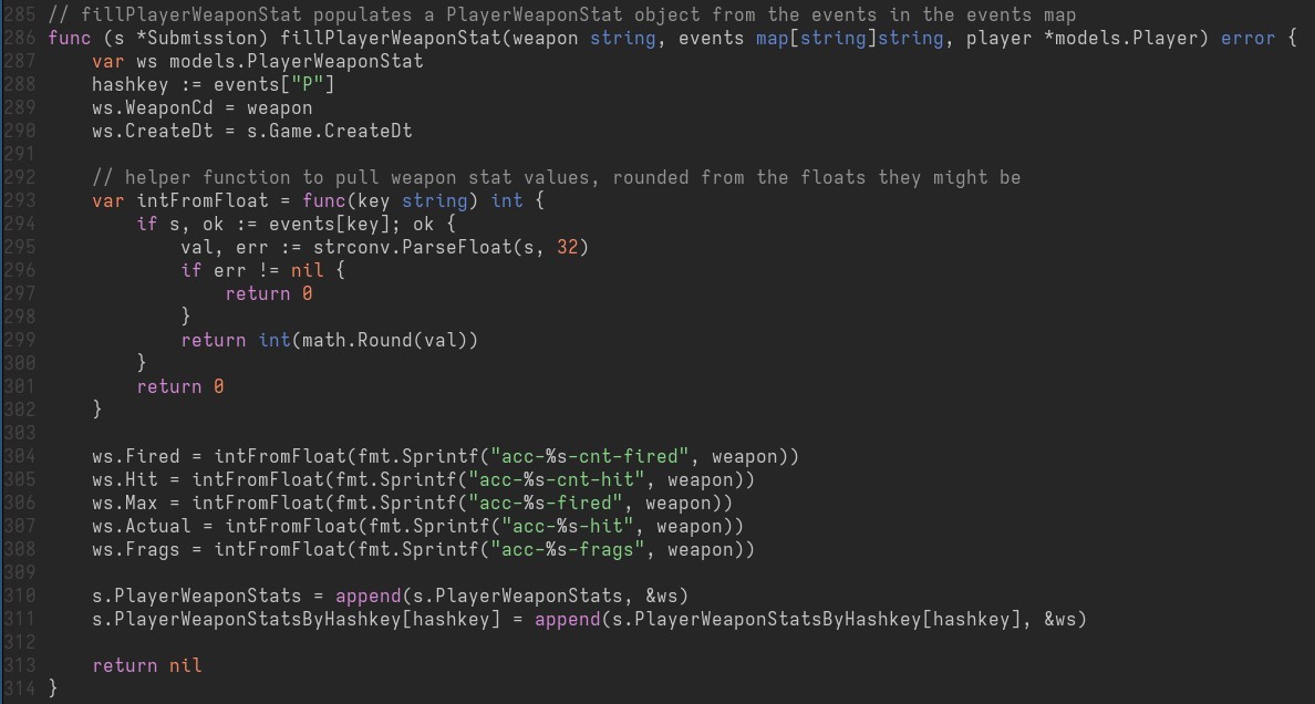
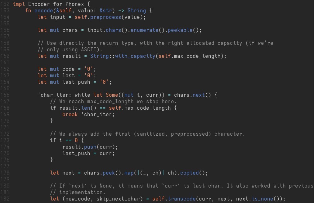
Here’s what it looks like for a couple of the projects I’m involved in.
XonStat (Go):

rphonetic (Rust):

With the font installed and configured on my system, there’s nothing left for me to do but to let it marinate for a while. Will it end up being the one to unseat DejaVu? Time will tell, but it certainly was a ton of fun to configure and build! It’s truly a tinkerer’s delight, and that’s worth something in and of itself.